
24 Feb
The 7 key elements of brand identity design
There’s more to crafting a memorable brand than putting together a quick logo and color palette. Instead of calling it a day there, successful brands take the time to design a well rounded brand identity – one that combines a strong purpose with intentional visual and written elements.
Here, you’ll learn the seven key elements of brand identity design, and how they work together to build a consistent brand your audience will love.
New to the branding game? Let’s go over some important context.
What is brand identity?
A brand is the sum of how a person, product, or business is viewed by its audience and/or customers.
Brand identity is how a business wants to be viewed.
These two ideas often go hand in hand, but can sometimes be at odds, depending on how well a brand is able to cultivate and maintain their brand identity.
If we zoom in a bit, brand identity design includes everything from logos, and typography to colors, packaging, and messaging. Ultimately, the goal here is to create an ecosystem of visual and written elements that complement and reinforce your brand’s ‘why’. Once established, your brand identity can both attract new customers and help your current customers feel at home.
That’s why It’s vital that your brand identity stays consistent. Because they represent and reinforce your brand’s purpose, your brand identity elements need to be clear and consistent wherever they might appear.
Why is brand identity important?
If you were about to interview for a big new job, you wouldn’t show up in sweatpants. You’d want to present yourself as a well put together, competent, and approachable candidate.
The same idea applies to your brand. Your brand identity is the face of your business, and you want to put your best face forward for your audience.
Along with building credibility and trust, a strong and consistent brand design should also give people insight into what your brand is all about. For example, do you use bright, pastel colors to convey a cheerful, playful tone, or do you employ detailed line art in your logo to imply an artisanal level of quality? When you’re thinking about what you want your brand identity design to look like, consider what it will feel like as well.
To give you a better idea of what we mean, take a look at these three brilliant examples of brand identity:
3 examples of strong brand identity design
When you’re designing your own brand identity, there’s no need to start from scratch. Here are just a few examples of great brand identity design to get some inspiration from.
And while it’s important to create something that’s uniquely your own, there’s nothing wrong with taking a note from some of the greats.
Hootsuite
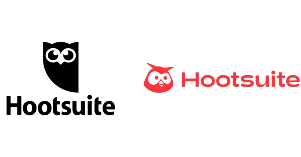
If you look at a lot of tech brands today, you’ll notice that many tend to use similar no-fluff, utilitarian branding principles. While there’s nothing inherently wrong with this, it can become hard to differentiate brands after a while.
We like how Hootsuite’s redesigned logo injects some new color and personality into the social media marketing platform. It’s friendlier, more approachable, and most importantly, more human.
Kodak
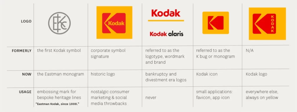
Sometimes, the best rebrands happen when you go back to your roots. In 2006, the company had already eliminated the big red “K” block in favor of a simpler wordmark, but then they decided to reverse the decision. Using a fresh sans-serif font, they were able to create a simple and fresh new take on their logo and typography. It just goes to show that sometimes the smallest of changes can have a big impact.
We love how easy these guidelines make it to view the history of Kodak’s branding, along with the when/how/why to use each design.
Burt’s Bees
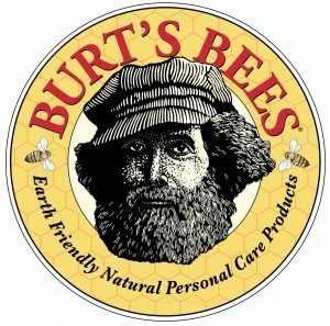
In a beauty industry full of incredibly bright, futuristic, or luxurious branding, Burt’s Bees stands out for its humble, down-to-earth aesthetic. With muted colors and thoughtful artwork depicting the brand’s founder, the brand calls back to its purpose – to honor the natural world by creating environmentally-conscious products.
How to build a successful brand identity
Now that we’ve taken a closer look at some great examples of brand identity design, let’s dive into the seven elements you’ll need to build a brand identity your audience will love.
1. Establish a clear purpose and position
The first part of establishing a brand identity is determining your purpose and goals. Brand purpose is the ‘why?’ behind everything you do. Why does my brand exist? Why is my product or service better than the competition? Why does our brand look/feel/communicate the way it does?
According to Arielle Jackson, startup founder, and Google veteran: “Your purpose is how you want to change the world for the better.” Jackson also recommends this diagram as a guide for determining your purpose:
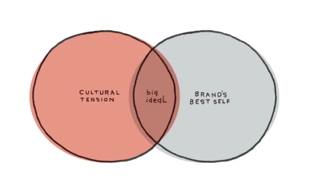
Jackson explains the diagram like this: “In one circle, you have cultural tension. This is what is happening in the world that’s relevant to you. In the other circle is your brand’s best self. This is what your company delivers at its prime,” says Jackson. “The intersection of these two areas is… ‘the big ideal’ — or your purpose.”
For a great example of a succinct, tangible corporate purpose, check out this statement from Apple:
“Apple’s 100,000 employees are dedicated to making the best products on earth, and to leaving the world better than we found it.”
Not too shabby, right?
You’ll also want to spend some time thinking about brand positioning, or the unique value that your brand brings your audience. Think of this as your brand’s ‘elevator pitch’. All the work done here will inform your strategy as you create a logo, decide on a color palette, etc.
Zooming out, brand positioning is the process of making your purpose actionable. By naming your target customer and differentiating yourself from the competition, you’ll lay the groundwork for your brand to accomplish your purpose.
2. Conduct thorough market research
A brand’s purpose and positioning can (and should be) informed, at least in part, by market and customer research. Research is crucial to understand the “cultural tension” described in the previous section. For beginners to market research, there’s a wealth of content online to help get you started.
Oftentimes, one of the best ways to conduct market research is to simply talk to a lot of people. For example, phone interviews allow your teams to have detailed, human-driven discussions with your customers – something that could be helpful if you want to appeal emotionally to your audience.
Beyond phone interviews, online survey tools, like Survey Monkey, are a fast way to gather a lot of information. Don’t forget to look into available government resources too, like this helpful toolkit from the US Small Business Association.
Good market research can also help you determine your main customer personas, a term that is a slightly different concept than “target customers.” Your customer persona(s) go beyond just defining what problem a customer has and gets into the nitty gritty details behind your focus customers’ professional and personal traits. Defining these traits will help you know what kind of personality your brand should have to appeal to customers, which brings us to our next point.
3. Craft a loveable brand personality
“If your brand were a person, what would they be like?” It might be a bit cliché, but this is a smart way to think about brand personality.
If you get your brand’s personality right, it will shine through in every part of your brand identity. Brand personality greatly impacts the voice and tone used in your marketing materials and other communications. Why is this important? Your customers will get mixed messages if your brand’s personality isn’t well established, and they may have trouble connecting emotionally with your brand.
If you’re having a hard time getting started, here’s an exercise to try: Which celebrities or fictional characters best represent your brand? Is there an actor or actress, musician, or public personality that embodies the same traits as your brand? This could be a good starting point for nailing down different aspects of your brand’s personality.
Once you’ve pictured the kind of person your brand would be and listed off a few attributes they have, it’s helpful to think about how your brand will come to life through your voice and tone.
Here is how we defined Marq’s brand personality.
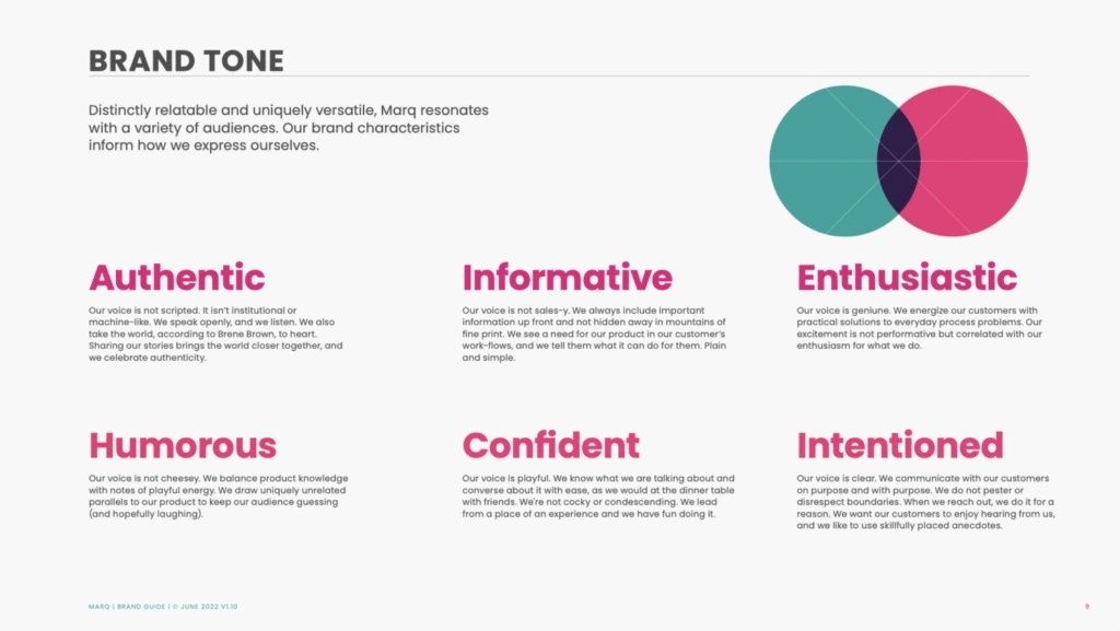
How did we do?
4. Make a memorable logo
Your logo is central to your brand identity design. It’s the piece of your brand identity that most people will be exposed to. It needs to line up with all the other elements of your brand identity and the broader emotional appeal of your brand.
A few guidelines Marq CEO, Owen Fuller suggests on making a logo with an impact:
- Make it memorable. Are there unique elements/colors/etc that make it stand out?
- Make it simple. Can a 3rd grader draw it?
- Make it versatile. Can you apply it across multiple mediums and channels?
- Make it evocative. Does it make you something?
- Make it timeless. Will it work as your brand grows?
For example, we all know this logo:

Disney has built a brand that evokes nostalgia and magic. The playful script oozes creativity and fun, which tracks with the overall brand Disney has established over the decades.
A memorable brand is often the simplest brand. Take a look at the logos of the world’s top 3 brands (according to Kantar):


What do all three have in common? Intentionality in color, design, and simplicity.
Speaking of simplicity, choosing a simple logo makes it easier to apply to different mediums. Whether you’re designing for a product, digital marketing, or print, actively designing with every channel in mind will ensure a successful logo development from the very start.
5. Choose an attractive color palette
Evocative and full of emotional potential, your brand colors are often just as memorable as the logo design. Consider looking into the dynamics of color theory when choosing the palette that best represents your brand.
A lot of color psychology is intuitive, like blue expressing calm and red and yellow expressing passion and energy. Depending on the tint or shade of a color you use, that emotion can be adjusted. A tint is a color mixed with white, making it lighter, and a shade is a color mixed with black, making it darker. A lighter tint of blue conveys tranquility, while a darker shade of blue often conveys trust, an effect that many banks use in their color schemes.
Be aware though that color connotations can differ wildly between cultures. For example, while yellow is often seen as a bright, happy color in the US, it is linked with mourning and death in places like Latin America and Egypt. If your brand plans to do business internationally, it’s important to double check that the colors you want to use don’t have any unintended meanings.
When it comes to creating a workable color palette, designers should select a set of primary and secondary colors to be used for specific purposes. Staying consistent with this palette is key – the more you use it in the same way, the more you’ll be able to build brand equity over time.
A few more considerations on picking a great color scheme:
- Make sure your palette has enough contrast when paired with text. This ensures all your marketing materials are easy to read and accessible. Use this tool to double check your palette.
- Double check that your palette reinforces the emotions you want to evoke. If your brand is all about health and wellbeing, strong colors like burgundy or magenta might be at odds with your intended brand identity design.
6. Pick the right typography
Stressing about finding just the right font may lead others to brand you as a “typography nerd,” but you’ll come out ahead when you pick a font that works in harmony with your logo and colors.
Fonts are powerful. The most famous fonts are recognizable even when taken out of context. You’ll want a single primary typeface to lead your brand design, which should work well with your logo and color palette. It should also, like your logo and color palette, be simple.
Here are a few tips to keep in mind when choosing brand fonts:
- Don’t use overly intricate fonts that are hard to read.
- Provide font guidelines for headlines and body text.
- Don’t use more than two font families on a single document. (If it feels like it’s too much, it’s probably too much)
- Do mix contrasting fonts (such as a serif and a sans-serif).
- Give guidelines on font size and line length in your brand guide.
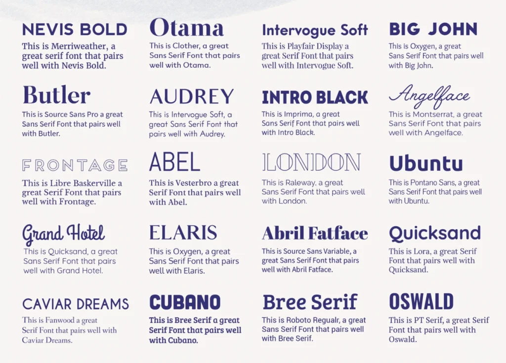
For example, here are several font pairings that work well together:
7. Leverage on-brand graphics and photography
The final step in creating a brand identity is to build an extended visual language with supporting graphics, design assets, iconography, and photographs.
Take a look at Google’s Visual Assets Guidelines to see how they carefully explain their take on icon design.
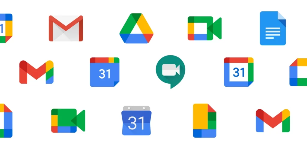
They cover a whole range of brand design considerations:
- A reductive (or “flat”) approach
- A preference for geometric shapes
- Icons always face front
- Straight, hard shadows as opposed to curved, soft ones
- Standard background colors
- Icons align to the pixel grid
- Icon padding according to shape
Because of Google’s close attention to their extended visual language, when you see a Google icon, you know it’s a Google icon.
Perusing other brand visual guides can help you get a better idea of what potential visual elements could work for your brand.
Maintaining a brand identity
Once you’ve got the perfect brand elements to work with, it’s time to secure your brand identity together with a comprehensive set of brand guidelines.
Brand guidelines offer an easily accessible playbook to educate your teams on how, when, where, and why to use each of your brand identity elements. With these guidelines, anyone from your company should be able to put your brand to work in a consistent way.
Once you have these guidelines in place, using customizable templates can help save your team valuable time. Instead of creating every piece of marketing collateral from scratch, leveraging custom templates makes it easy to quickly create on-brand materials, even if you’re not a graphic designer.
Key Takeaways
While there’s always the possibility of redesigns and re-evaluation ahead, starting off with a strong, confident brand design and unified brand identity will add clarity and consistency to everything you do. Over time, your unique brand identity will be the one that pops into people’s heads when they have a problem you can solve.
Ready to start building on brand? Sign up for free and explore our brand template library today.